


 English
 Español
Amy Lou
Tel: +86-13750976592(whatsApp / Wechat)
E-mail: [email protected]

Jewelry packaging carries more than the jewelry itself. Box structure, surface texture, insert design, and logo position work together to shape the visual impression before the product is fully revealed. Jewelry packaging boxes with logo can therefore create very different experiences simply by moving the same logo from the outer lid to the inner cover or insert.
Logo placement deserves attention because jewelry boxes usually have limited visible surfaces. A small ring box, earring box, or necklace box cannot accommodate unlimited graphics without making the design feel crowded. Recent packaging references commonly show logo placement on the lid, inner lid, sleeve, insert, front panel, and jewelry card.
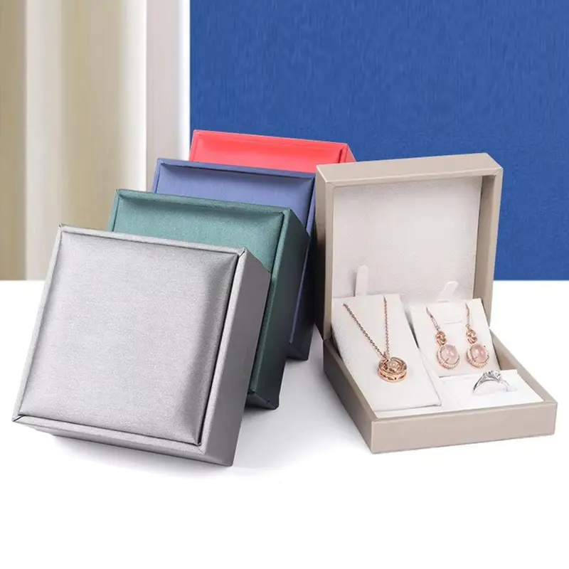
The outer lid is the natural viewing point during storage, retail display, gifting, and delivery. A centered logo creates a direct visual connection between the box and the jewelry collection.
Placement should also stay clear of folds, seams, magnetic components, and closure hardware. Some packaging specifications recommend keeping printed marks away from fold lines to protect alignment and readability.
Outer branding is visible before opening, while inner-lid branding appears during the unboxing sequence. This creates two different communication points.
Jewelry packaging boxes with logo can use the outside for a simple emblem and reserve the inside for a message, collection name, care instruction, or secondary brand mark. Such an arrangement keeps the exterior visually clean while adding another branded detail after the lid is lifted.
Logo dimensions become more sensitive as packaging gets smaller. Fine lines, narrow lettering, and intricate symbols may lose clarity during foil stamping, embossing, or printing.
Some packaging specifications suggest logo line widths around 0.3–0.4 mm and text around 5–6 pt as general production references, although the workable range depends on the finishing method and surface material. Vector artwork such as AI, EPS, or SVG is commonly preferred for accurate production.
Logo position and finishing technique should be considered together. Hot foil stamping creates metallic contrast, while embossing and debossing add physical depth without relying on strong color contrast. UV printing can support detailed or multicolor artwork.
Paper, coated paper, PU leather, velvet-style surfaces, and textured materials react differently to printing and stamping. Smooth surfaces generally provide sharper printed details, while textured materials can benefit from simpler artwork and stronger contrast.
Jewelry packaging boxes with logo should therefore be evaluated as a complete combination of material, logo size, placement, and finishing process. A gold foil mark on dark paper creates a different impression from blind debossing on textured kraft paper, even with identical artwork.
The interior insert does more than hold rings, earrings, bracelets, or necklaces. It can also carry a small logo, collection code, jewelry card, or care message. Such details extend branding toward the actual product presentation instead of keeping every graphic element on the exterior.
Custom inserts can also be shaped around different jewelry types. Earring holes, ring slots, necklace hooks, bracelet cushions, and die-cut holders provide dedicated presentation areas while creating additional surfaces for subtle brand details.
Logo placement can change how jewelry packaging communicates before, during, and after opening. Jewelry packaging boxes with logo do not need large graphics to create recognition. Careful positioning, suitable artwork proportions, compatible materials, and an appropriate finishing method can produce a more controlled visual experience.
The practical question is not simply where the logo can be printed. The better question is which surface should carry the brand message at each stage of the customer's interaction with the jewelry box?
5F, Building 1, No#8, Jiangwan Street, Yiwu City, Zhejiang Province, China, 322000 CN
